Quick path
Keep the arrangement
- Choose a style preset.
- Review the furnished room.
- Confirm the staging renovation.
House Flip · Product & UX design · Mobile game
More control should not turn every room into a lengthy editing task. I designed flows, contextual tutorials, and store structure that connect quick decorating, item-level customization, and clear purchase decisions.
The player’s task
House Flip is a renovation game: players improve and furnish houses, then sell them to progress. Furnishing a room is called Staging. The same player might want a quick result today and detailed creative control tomorrow.
Explore the two paths ↓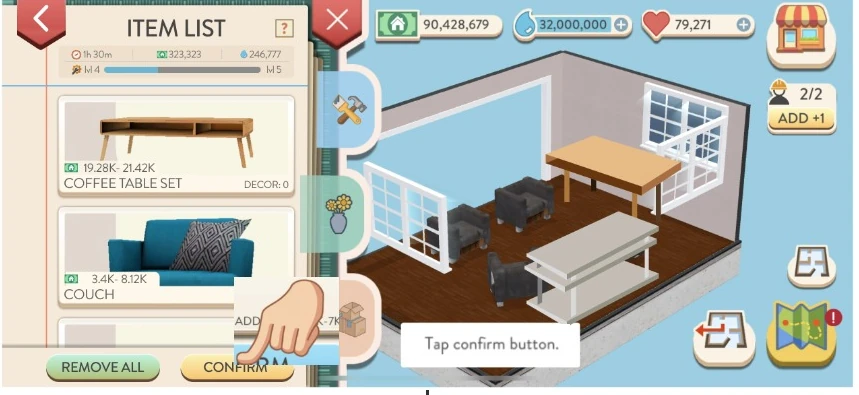
Detail from the same handoff, cropped to make the item list and room-level action readable. The original tutorial hand and labels are preserved.
Problem & scope
The earlier system used a style, progression level, and shared color choice to determine a room’s furniture. Players wanted to mix styles and customize individual items. Adding those choices affected more than the editing panel: it changed what players needed to learn, what they owned, and how the store described new content.
I focused on the journey from a usable room to a personal one. That meant protecting the quick path while specifying the detailed path, the tutorial conditions, and the purchase rules behind it.
Design principle: let players decide how much detail to take on, then make the next action and its scope clear.
Decision 01 · Progressive control
In Staging 4.0, a preset supplied an arrangement using the selected style, default swatches, and the player’s item capacity. Players could confirm that starting point or use Mix & Match to change individual items. The preset and the editor served different intentions within the same task.
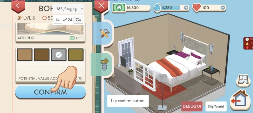
These are the before-and-after states paired in the original tutorial handoff. Its room artwork varies between states; this is a comparison of the staging task and controls, not identical-room usability-test captures.
2026 reconstructed diagram · Summarizes the original Staging specification, not a new game interface.
Quick path
Detailed path
Individual control introduced a new burden: changing each item’s color could become repetitive. The design discussion compared a bulk preset entry in the item list with an “Apply to Style” action inside item selection. I supported the preset-selection feature and its UX; version 4.1 added Set Selection so players could choose a color set while keeping Mix & Match available.
A bulk operation is useful only if players understand what it changes. The preset-button proposal applied the collection to items still using the original preset style, skipping items whose style had been changed. That rule belongs to the proposal; the tutorial-routing image below is not a screenshot of the final Set Selection UI.
Specified in the original Staging 2.0 GDD. These rules explain the flow; they are not a claim that every state was independently tested.
Decision 02 · Contextual learning
The dedicated tutorial kept a simple room-completion task and previewed deeper customization for later. In the earlier 4.0 plan, detailed Mix & Match teaching began in the first purchased house. The 4.1 NEW tutorial delayed that lesson: a new player first sells three houses, receives a decor item, then learns customization in a room where that item can actually be used.
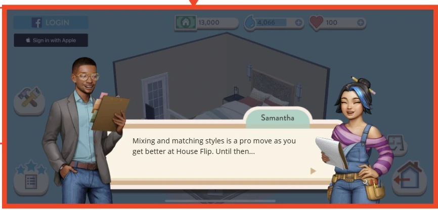
Earlier plan · 4.0
NEW tutorial · 4.1
2026 reconstructed comparison from the 4.0 GDD and 4.1 NEW tutorial table. The gift and the editing lesson have separate triggers.
Players who had missed the 4.0 tutorial first learned Mix & Match when entering Staging after updating. Decor followed in the next house, when they opened Mix & Match. The routing also checked previous tutorial experience and ownership of a style suited to the neighborhood, with a separate route for players who lacked that style.
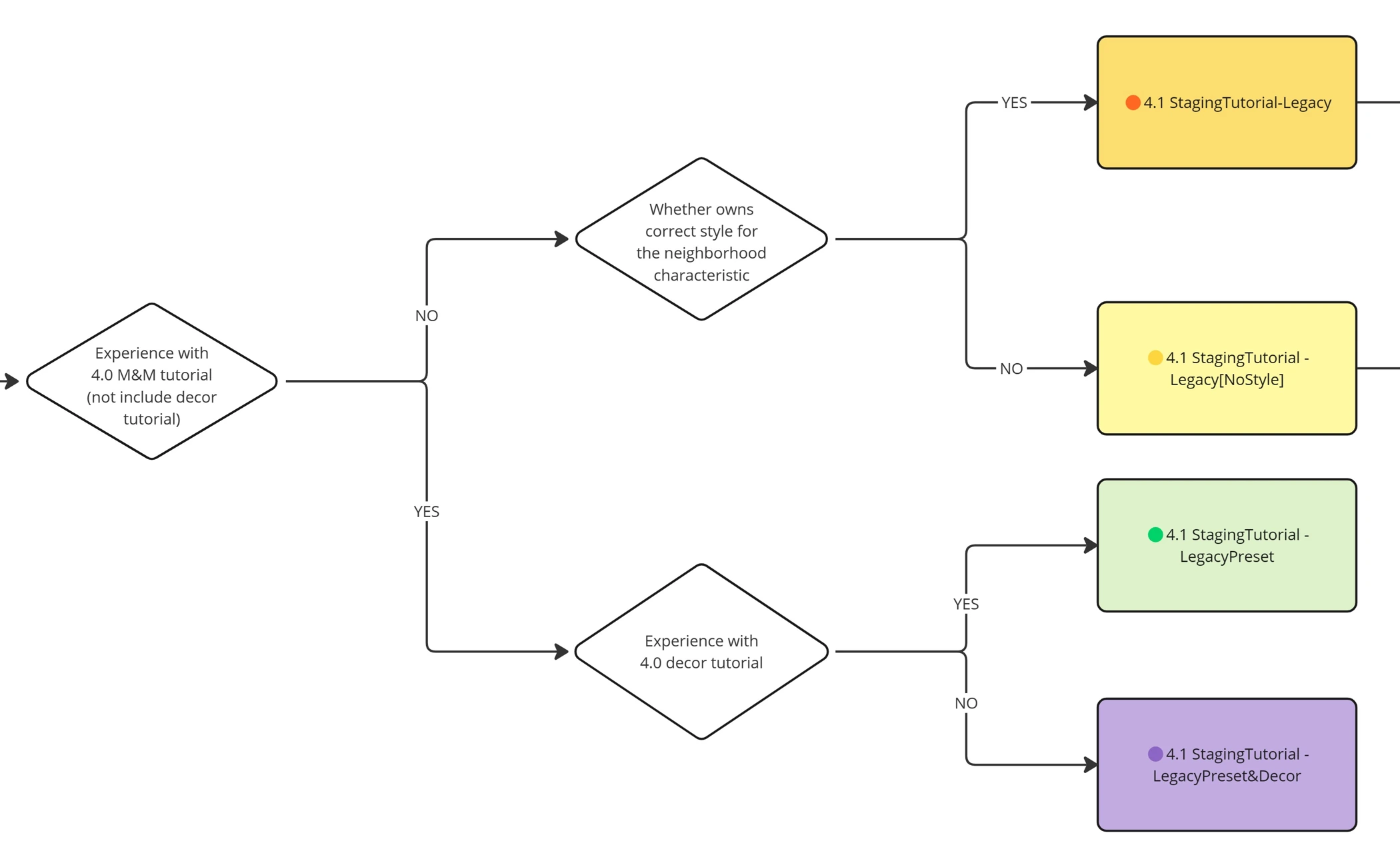
Moving a lesson later protects the first task, but makes its trigger conditions more important. I specified the audience, trigger, teaching intent, guided action, and text key; marketing helped finalize the dialogue. That made “teach it later” an implementable condition rather than an unspecified promise.
Decision 03 · Purchase understanding
Additional room types created a mismatch in expectations. A style purchase covered the seven base room types, but not every style had been produced for the new room types. A familiar style name alone could suggest more coverage than a player would receive.
I designed store structure, purchase flows, wireframes, and pricing/scope proposals, then worked with a UI designer on detailed screens. The central question was what a purchase unlocked—and how the player could see and use that content.
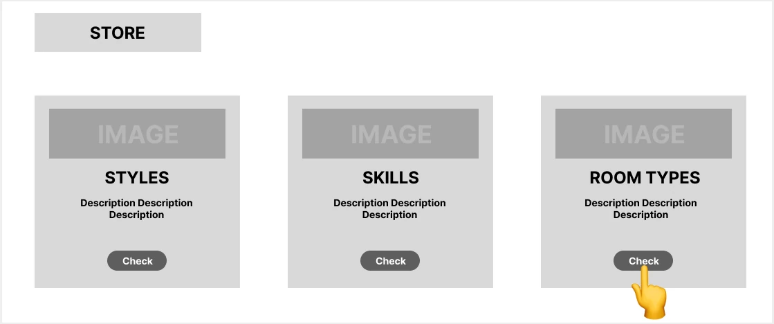
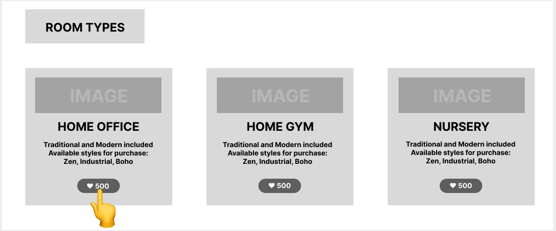
The early model proposed buying a room type with two basic styles included. I compared two ways to offer more styles after purchase: open a dedicated list for that room, or expose the style choices on the room’s card.
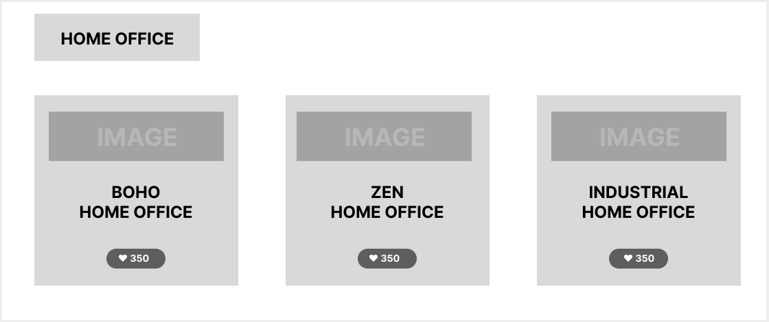
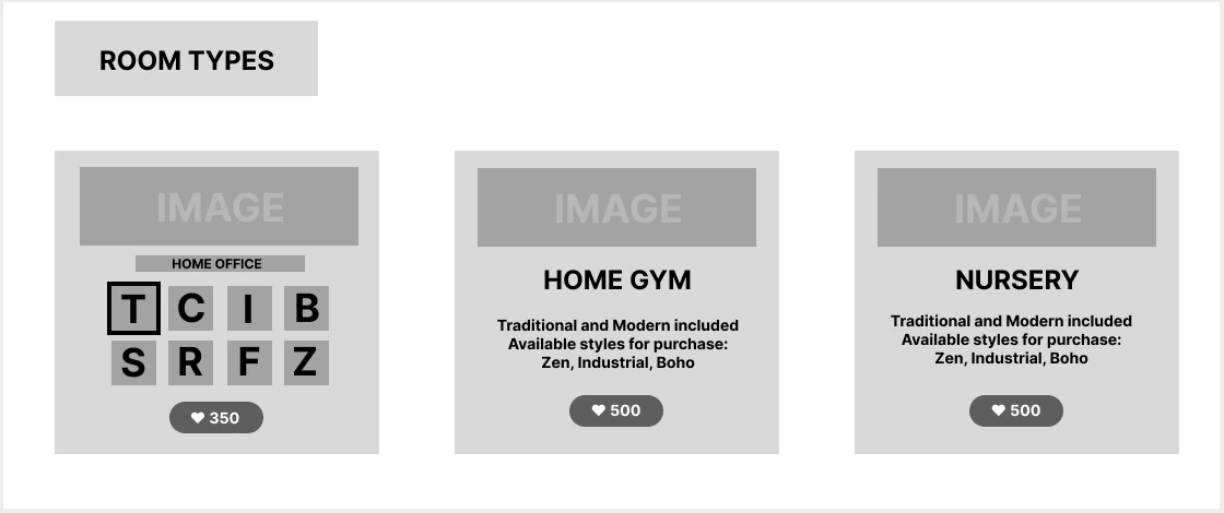
The tradeoffs above are my current reading of the original alternatives. This case does not claim that a usability test selected a winner.
Production time and incomplete style coverage shaped the release scope. The later Quick 4.2 specification kept style purchases for the seven base rooms and sold additional rooms as style–room combinations, such as a specific style of Home Office. In that model, the two basic styles were also purchased for additional rooms. The early “two styles included” wireframe therefore cannot represent the final purchase rules.
| Version | What the player buys | Design status |
|---|---|---|
| Early FULL exploration | Room type with two basic styles; further styles offered separately. | Structural alternatives and wireframes shown above. |
| Quick 4.2 | A style for seven base rooms, or an individual style–room combination for an additional room. | Reduced release scope; store categories, descriptions and Preview changes are recorded in the build report. |
The full reorganization needed more content and implementation time. The smaller version retained more of the existing store and used categorization, item descriptions, and preview to explain the offer. The work was not only adding another purchase button; it was keeping content availability, ownership, and the interface consistent.
Delivery & evidence
The 4.2 build report confirms new store categories, descriptions, and improved Preview. It also identifies an analytics gap: events did not distinguish a style-purchase page reached through the store from one reached during renovation.
That prevented the team from attributing purchase-funnel behavior to the store path alone.
In the 4.2 report, sales per daily active user rose for 8 of 11 staging styles, comparing November 24–29 with December 1–6, 2023 in the report’s US / OG cohort. This is a descriptive release comparison, not evidence of a conversion increase caused by the store design. The missing entry-point events limited the planned funnel analysis.
The useful next check is to instrument the two entry paths separately and observe whether players can explain what a purchase covers before confirming it.
My strongest lesson from this work is to design the shortcut, the detailed path, and the rules behind both together. A feature becomes easier to deliver when its teaching conditions and ownership boundaries are as explicit as its screens.
Related work · 2023
A house preview helps players decide whether to buy a property. A Landmark serves a different intent: exploring a featured space and its content. I compared those motivations and proposed direct entry for version 4.0, removing the extra modal action between selecting a Landmark and exploring it.
I organized the experience around Lobby, Featured, Coming Soon, and My Collection, with naming and navigation that could accommodate more content. The GDD was submitted on July 12, 2023 and approved the following day. A proposed two-level navigation structure belonged to Phase 2, so it remains separate from the initial scope. The supported outcome here is an approved design direction and defined navigation structure; I do not attribute a conversion increase to this change.
Later work · Separate design phase
Later Dream Home work reframed regular house flipping as progress toward a personal home. The May 2026 onboarding specification distinguishes new and returning players: preview the goal, understand the resources, earn through regular play, purchase and name the home, then complete a first decorating action.
I also defined progression gates and compensation for returning players so earlier effort retained value. The design was adopted as a basis for prototype and implementation planning. This is a later design phase, not part of the 2023 releases above, and it has no verified launch or retention outcome in this case.