01 / Discover an episode
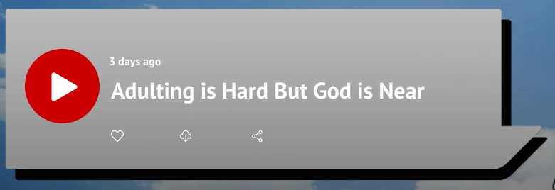
A title and one prominent play entry.
The featured card offers a direct route for someone ready to listen. Its topic is visible before the action.
Inspect image ↗
2 Empower U · Web UX & visual identity
I redesigned a Christian podcast’s website around the listener’s next decision—understand the show, choose an episode, and press play. Prototype feedback and Podbean’s technical limits shaped what I designed, changed, and left out.
Put an episode title beside one prominent play entry, so visitors can decide what to hear.
Original high-fidelity prototype. The phone presentation focuses on the featured card; the full introduction and listening options appear in the task below. These are static design excerpts, not a working podcast player.
2 Empower U is a Christian podcast with practical advice for younger adults. A first-time visitor needs to understand its perspective before committing to an episode. An existing listener may already know the show and want to find a relevant topic or reach the host.
The redesign brings those decisions onto one page: a show introduction and listening-platform links, an episode list with direct play controls, and context for the host’s services. The screens below are the original prototype, presented as a static task walkthrough.
01 / Discover an episode
The featured card offers a direct route for someone ready to listen. Its topic is visible before the action.
02 / Understand the show
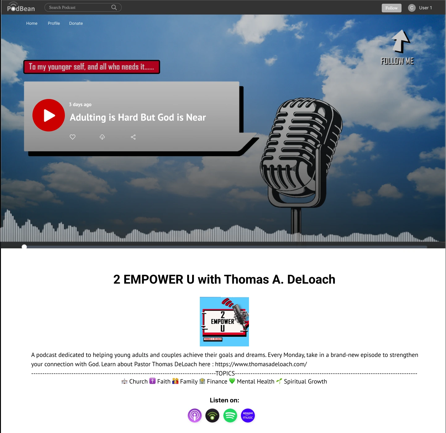
A new visitor can read the show’s perspective, Monday release cadence, and topics—faith, family, finance, mental health, and spiritual growth—before choosing.

03 / Choose where to listen
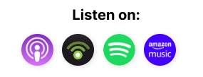
The archive puts dates, titles, and play controls together. The introduction also offers external listening platforms.

This walkthrough uses static excerpts of the original high-fidelity prototype. Playback, a selected-platform destination, and playback feedback were not captured in these exports; they are not simulated here.
The stakeholder wanted more listening, donations, and visits to the host’s website. Research on the existing page found repeated information, too much scrolling, and important links that were easy to miss. Visitors also needed a clearer account of what the podcast offered.
I focused the page design on content hierarchy and useful next steps. Working with another UX designer, I explored two low-fidelity directions so the team could compare concrete choices: horizontal versus vertical sections, image-heavy versus simpler presentation, and different contact options. The research team evaluated the prototypes with five potential users.
Three decisions shaped the page.
The five-person study was a qualitative prototype comparison. The separate branding survey gathered 30 responses; these were different research activities.
Podbean required a predefined template. Its first two sections allowed content, font, and background changes, but not custom structure through inline CSS. I evaluated seven templates and shortlisted three; the stakeholder chose Podisc. That established the structure we could work within.
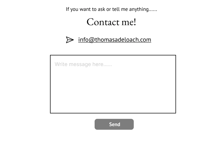
Version A included a message field on the page. A developer’s feasibility check found that direct messaging could not be supported. We continued from Version B, which provided email contact, and carried useful elements from both prototypes into the next iteration.
This preserved a way to reach the host, but left the conversation outside the page. It also changed my process: I would validate uncertain platform behaviors with a small working test before investing in their interface.
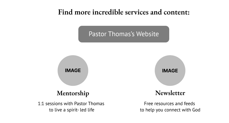
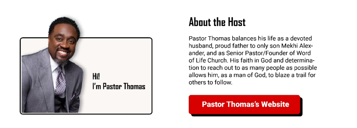
The prototype comparison revealed two related gaps. Participants looked for information about the host, and they tried to click the service illustrations. The earlier layout offered a general website button without making those expectations explicit.
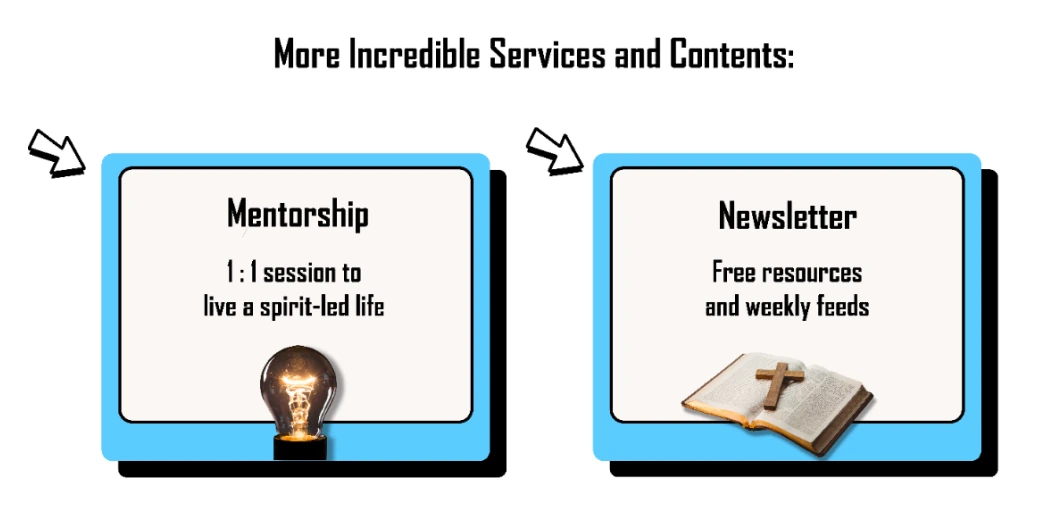
I added an About the Host section and moved the host’s website link beside it. For mentorship and the newsletter, the revised design gave each service its own linked graphic rather than asking visitors to infer a route through the general website button.
Adding host context made the page longer, so I simplified supporting graphics and used a stronger vertical reading flow. The design balances explanation with action; whether visitors reach the right destination still needs checking in the implemented website.
The earlier prototype used image-based episode rows. The host was still adding covers to older episodes, so I changed the high-fidelity design to Podbean’s simple list view. Episode titles, dates, and play controls could carry the browsing task without waiting for a complete set of artwork.
The tradeoff was less visual variety in the episode list. I kept the stronger visual identity in the introduction and supporting sections, while allowing the archive to rely on text. The page could therefore express the show’s personality without requiring every episode to have a cover.
I developed the wider identity through a separate branding survey with 30 responses, then applied the palette, typography, logo, and graphics to the prototype. That research informed the visual direction; it did not measure listening behavior.
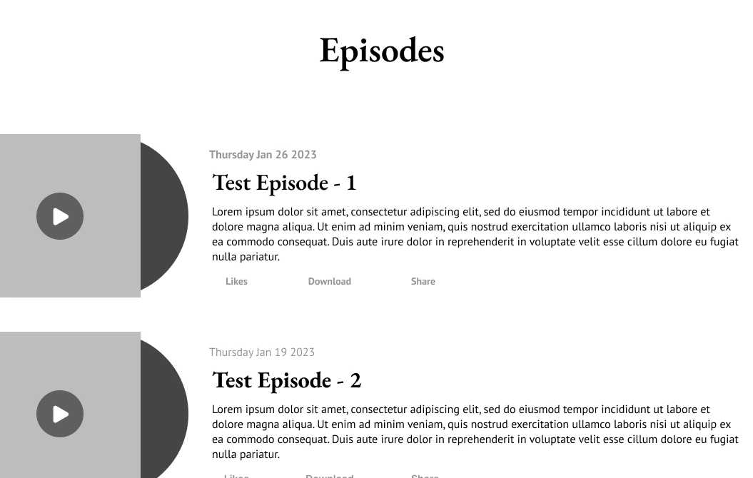
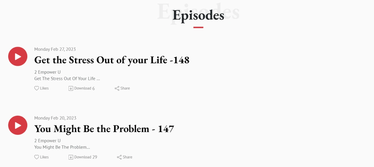
Use dates, titles, and play controls without requiring cover artwork for every episode.
Original high-fidelity design. The list uses content available at the time.
I developed the logo, graphics, palette, and typography alongside the website. A separate survey with 30 responses and a comparison of 12 podcasts informed the branding work. The featured episode and service illustrations carry that visual direction, while the archive remains a straightforward text list.
#D80000#5BCBFF#000000#FAFAFAOriginal type choices: Agency FB and PT Sans. The original page above shows their application alongside the microphone illustration, logo, and graphic links.
Palette and type names transcribed from the original case study. This summary was assembled for the portfolio in 2026.
I delivered low- and high-fidelity prototypes, website graphics, and visual guidelines. The design incorporated the research team’s feedback and the developers’ feasibility findings: a contextual host link, service-specific entry points, an email contact route, and an episode list that matched the available content.
The outcome I can demonstrate is that design progression. I would next test the implemented listening task: can a new visitor describe the show, find an episode on a relevant topic, and start playback? I would also check whether the service graphics communicate their destinations and whether the long page delays episode discovery.
This project taught me to treat a platform’s limitations and unfinished content as design inputs. A useful redesign depends on the path that can actually be delivered, as well as the one people prefer in a prototype.
Status: design and visual-system deliverables. This case does not claim a verified launch or measured increase in listening, donations, or retention.