Content density
Give events enough room.
The handoff calls for larger category and event blocks. The interface needed to accommodate real titles, rather than only fit a tidy grid.
NYU Game Center App · Product definition & mobile UX
Events, announcements, and opportunities were scattered across channels. I co-initiated a Game Center information hub, narrowed the first design scope to the reader’s homepage, and guided an interaction design that supports browsing by category or by time.
The reader’s task
The homepage brings announcements, dates, and event details into one view. A reader can scan the day’s events, move through time, or switch to the kinds of opportunities they care about.
See how the views work ↓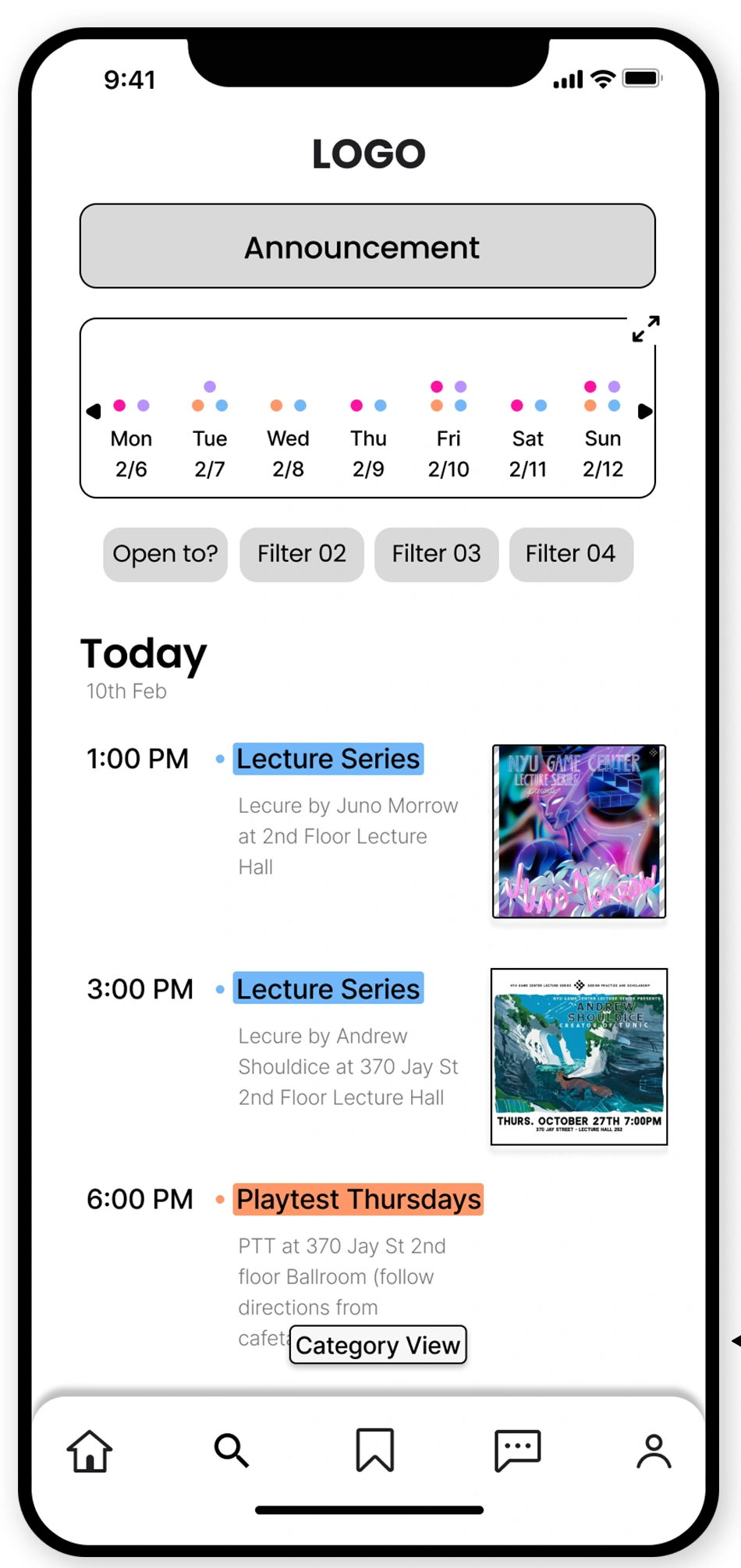
Decision 01 · Product scope
Students and staff described a familiar problem: useful information was hard to separate from the volume of updates spread across several channels. People posting events faced a different burden—repeating the same work on multiple platforms. Both problems mattered, but they called for different workflows.
With my co-initiator, I defined the first design scope around the information receiver: a mobile homepage for recent events and announcements, with filtering and a timeline. This gave the team a concrete task to design and evaluate before expanding into publishing and attendance management.
Stakeholder conversations made adoption, funding, maintenance, and event statistics part of the product discussion. I helped align scope and responsibilities around those constraints. The homepage addressed discovery; it did not remove the need to decide who would publish and maintain the information.
A compact first scope meant postponing valuable tools for information publishers. Keeping those tools in the roadmap made the dependency visible without pretending they were solved by a better homepage.
Decision 02 · Interaction structure
We compared three early wireframes, then two low-fidelity prototypes with potential users. Feedback did not point to one universal way to browse. Some preferred events grouped by category; others liked a familiar swiping timeline. A calendar-led view showed too little event detail, while dense layouts and excessive controls made scanning harder.
I used those findings to guide a mid-fidelity homepage with two switchable views. List View presents events chronologically with times and descriptions. Category View groups items such as talks and work opportunities. The control at the bottom of each content view names the alternative.
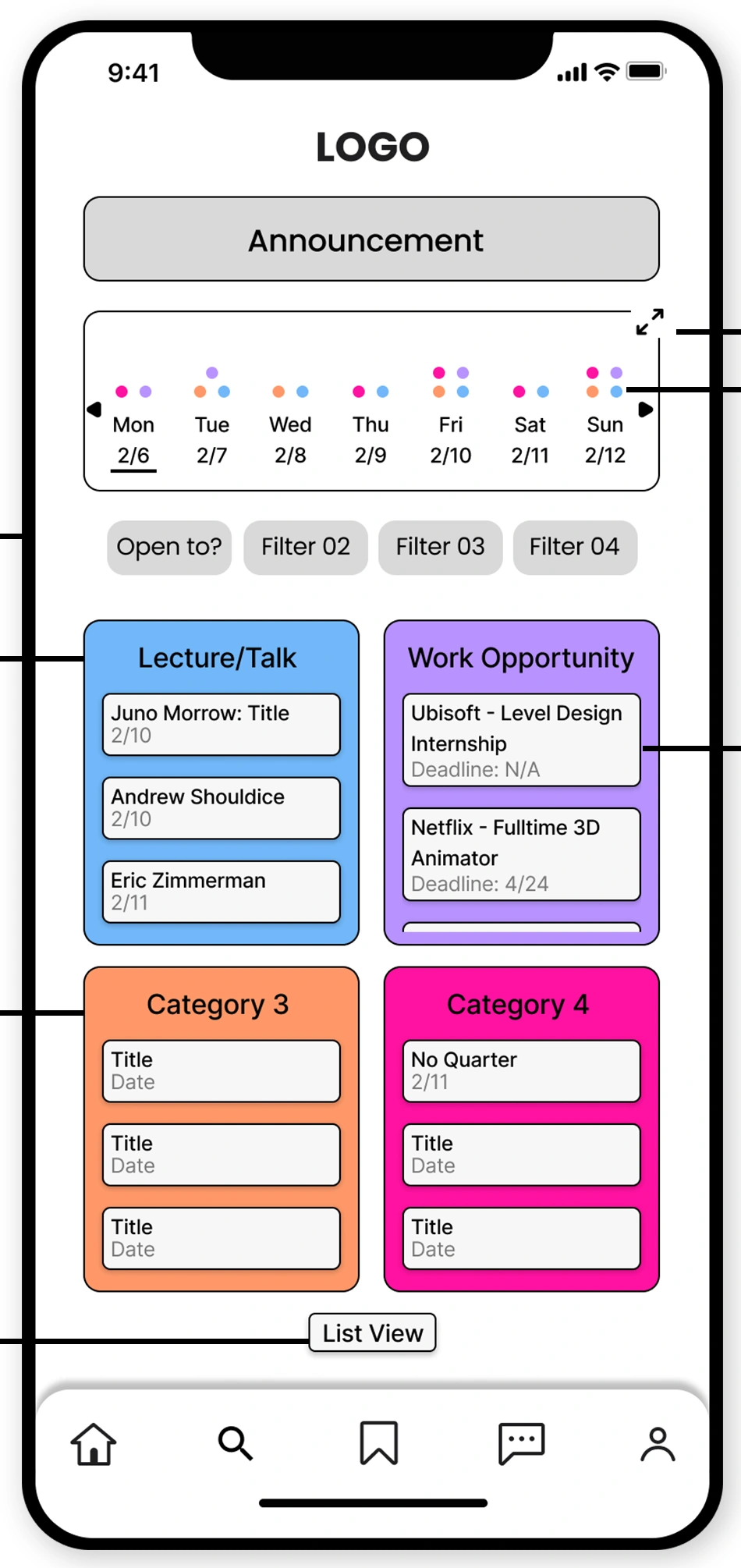
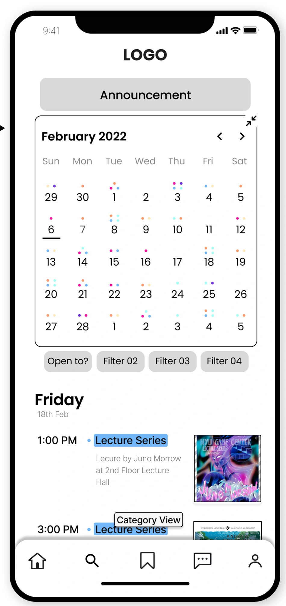
I also adopted the simpler inline filter treatment instead of a floating filter button. The annotated prototype retains search in the bottom navigation, reflecting feedback that a menu entry was sufficient. These decisions reduced competing controls while preserving two distinct browsing intentions.
Supporting both views avoided forcing everyone into the same organization, but made the switch itself important. The small text control and the meaning of the category colors remained issues for the next design stage. The comparisons established a direction, not a measured improvement in finding information.
Decision 03 · Design handoff
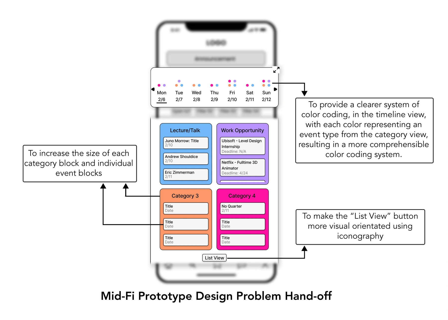
I prepared the 11-screen homepage handoff and documented the relationships between screens. I also recorded specific issues for the visual designer to resolve, so the next phase had more than a set of wireframes to interpret.
Content density
The handoff calls for larger category and event blocks. The interface needed to accommodate real titles, rather than only fit a tidy grid.
Shared meaning
Timeline dots and category blocks needed the same mapping. Mixed reactions to color coding made consistency an explicit issue to resolve.
Control recognition
The handoff proposed a more visual List View control. Whether people noticed and understood the switch still needed testing.
My co-initiator and I also prepared real Game Center events and announcements for prototyping and development, alongside style direction grounded in the community. A separate visual designer was responsible for the high-fidelity design. My work here established the product scope and interaction structure that informed that stage.
Delivery & reflection
The project produced a receiver-focused MVP scope, an 11-screen homepage handoff, and documented design questions for further work. It did not establish a launched app or measured changes in attendance or information-finding time.
The next research phase needed to go deeper into the community’s information needs and which content types belonged in the product. For the homepage itself, I would test three concrete tasks: find an event this week, locate a relevant work opportunity, and switch browsing views without losing track of what to explore.
What I learned: Choosing the MVP is not only deciding what to leave out. It is making one useful task clear enough to design, discuss with stakeholders, and hand to the next person—with its open questions still visible.