Using the power
What do I choose?
Highlight the opponent and hand card. Name the action before confirmation.
Dodgeball Dojo · Multiplayer game UX
A power can change the game—if players know how to use it and what just happened. I redesigned the interaction from the perspectives of the person using it, their target, and the players watching.
The task, in one sentence
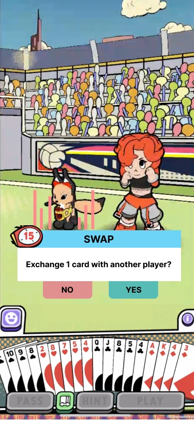
In this mobile card game, a pet ability called SWAP exchanges one of your cards with another player. The player using the ability needs to select both a person and a card.
See the design decision ↓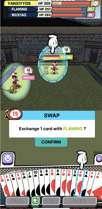
Highlight both the opponent and the hand card before confirmation.
Name the selected player in the confirmation instruction.
Problem & scope
The design file records players choosing an opponent without realizing they also needed to select one of their own cards. Confirm then appeared unresponsive. For the other players, it could be unclear who had been targeted or what the power had changed.
This interrupts the ability’s core task: make a deliberate choice, then understand its effect. I focused on selection, instructions, and feedback across the three perspectives, keeping the underlying SWAP rule intact.
The original design file documents these player-feedback issues. It does not record a participant count or a measured improvement after the redesign.
Decision 01 · Selection & confirmation
The earlier sequence let a player choose an opponent while missing the required card selection. I introduced a preselected opponent and hand card, with a visible highlight around each. The confirmation instruction names the action and the selected player.
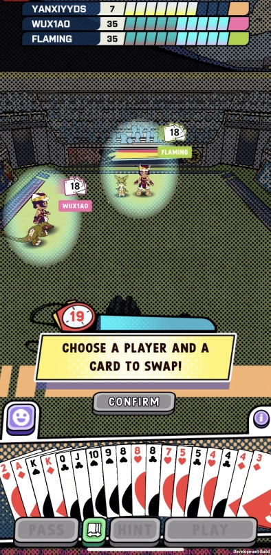
Preselection gives the action a complete starting state. It also creates the risk of confirming the default without noticing it. In a follow-up test, I would ask players to select a different opponent and card, then check whether they can explain exactly what they are confirming.
Decision 02 · Role-specific feedback
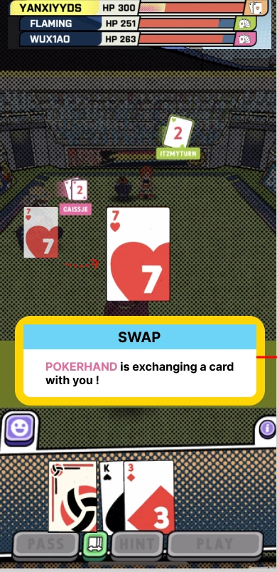
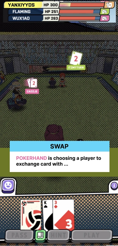
The person using SWAP needs instructions for making the choice. The target needs to recognize that the action concerns them and understand the card exchange. A spectator needs to follow who is acting on whom without being asked to act.
Using the power
Highlight the opponent and hand card. Name the action before confirmation.
Being targeted
Show a target-specific message and make the affected card visible.
Watching
Explain the actor and target while preserving the spectator’s view of the round.
Decision 03 · Timing & hierarchy
The original notes distinguish two problems: players had enough time to read, but the timer bar made them feel hurried; descriptions also competed with the action. I changed the timer presentation, separated the power title from its body text, and shortened generic instructions.
I used current health when it could help players choose a target, instead of requiring them to infer health from an energy value. The purpose was to put the information needed for this decision close to the decision itself.
These changes respond to observations in the original notes. They are design decisions, not a claim that a follow-up test proved better comprehension.
Selected states · Original SWAP specifications
These key states from the fourth-draft board explain the intended task and its feedback. They preserve the original draft’s varying placeholder players and cards; they are not consecutive captures from one match. Select any image to inspect it.
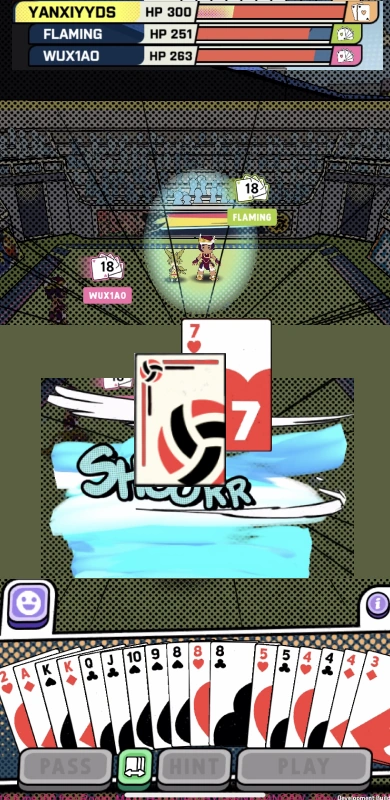
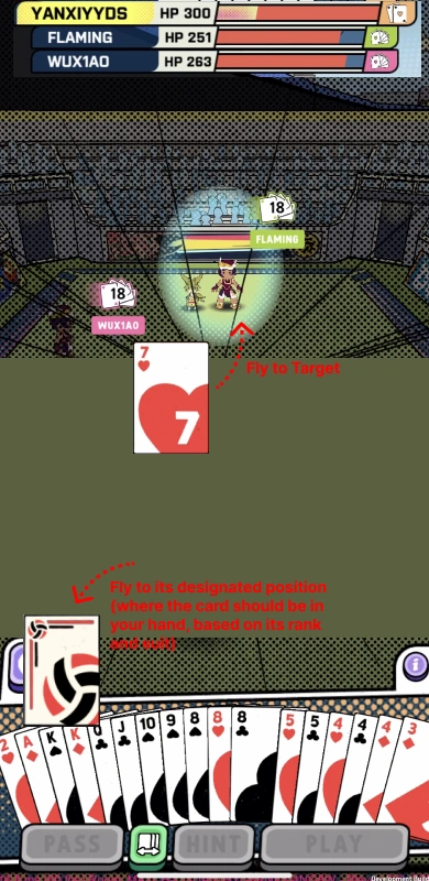
All screens are crops of the original fourth-draft board. This is a static presentation of designed states, not a playable prototype or a recording of a released build. The source does not show a cancellation step after selection, so one has not been added.
Delivery & reflection
I delivered four design drafts, role-specific before-and-after flows, and a full SWAP example. A matched release or follow-up test is not documented for this proposal. The fourth draft makes selection, text hierarchy, target feedback, and the transition back into the round explicit enough to discuss screen by screen with the team.
For me, the central lesson is that an ability is more than the screen where someone activates it. The interaction also has to make sense to the people on the other side of that choice.